 Lisa Spangler's second "Schribble This!" challenge is about levels.
Lisa Spangler's tweede "Scribble This!" uitdaging gaat over niveau's
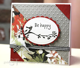 This is how my card/photo turned out after following Lisa's Learning about Levels tutorial
Zo ziet mijn kaart/foto er uit na het volgen van Lisa's uitleg over niveau's.
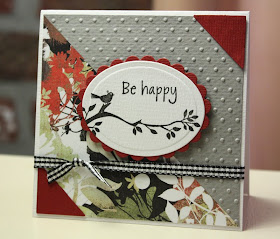 The "before" photo. I only used custom white balance setting (white balance tutorial)
Voor het bewerken zag de foto er zo uit. De camera was ingesteld op custom white balance (white balance uitleg)
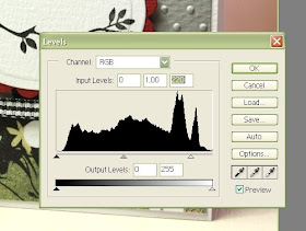 I used Photoshop, (tried it in GIMP too, worked well). I moved the white arrow at the right a bit to the left.
Deze screenshots tonen wat ik in Photoshop deed. Ik heb GIMP ook geprobeerd, lukte prima. Het rechter pijltje een beetje naar links verschoven.
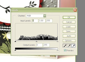 I tried a few spots with the eyedropper, some spots made it look really white, but also the texture on the white oval disappeared.
Met de druppelteller een paar plekjes uitgekozen, als het te wit werd, verdween ook de structuur van het witte Papicolor papier.
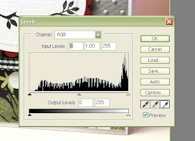 So I went for this setting, not too white and still enough texture on the white cardstock.
 Thanks for another great tutorial Lisa!
Dus heb ik gekozen voor niet al te wit, met behoud van de structuur.
Bedankt voor de heldere uitleg Lisa!
Hero Arts stamps: CL154 Brackets and Tags, CL151 Share Laughter

Wow... looks like you're succeeding with the cards you're displaying.
BeantwoordenVerwijderencute card:)
BeantwoordenVerwijderenNice card! I had to skip the eye dropper step on some of the pictures, because the details on the white cs dissappered! It was very neat to learn though!
BeantwoordenVerwijderenVery pretty card. Great job with the photos also.
BeantwoordenVerwijderenThe gray and red is just stunning.
BeantwoordenVerwijderenHi, Godelieve! Great results from Lisa's tutorial! I love how it brings out the red and green tones in your beautiful card! :-)
BeantwoordenVerwijderenChanging all those features on the editing really did result in a crisper looking photo. I don't have the patience to go through all those steps myself. What a nice card. I like the angled stripes and the color/paper choices.
BeantwoordenVerwijderenIsn't it fun to play around with? I am in love with the eyedropper tool, but I like the ability to drag the little arrows around too! I use GIMP and I couldn't be more pleased.
BeantwoordenVerwijderenI LOVE your card by the way! It's beautiful!
Your card looks great! =)
BeantwoordenVerwijderenBeautiful card and a good picture.
BeantwoordenVerwijderen